Monday, March 11, 2024

Ps HW 2


    In the documentary, they share that Platon is one of photography's few big cultural provocateurs. It starts by saying that the story, the message, the feeling, and the connection are important in a photograph. Everything Platon photographs is a chance to comment on what is happening in the world, whether good or bad. He cares for humanity, and his photographs share stories reflected through emotion, all because of his creativity behind the angle or exposure of the picture. For instance, Platon uses his hands because he believes the body helps narrate a story. There is always something going on in the photograph; capturing those small details entails a stronger story narration.

    Platon has countless incredible photographs (portraits) that tell a story. It was hard to choose one, but when I encountered Robert De Niro’s portraits in the documentary, I knew I had found a photograph that appealed to my emotions. De Niro is one of my favorite actors, as it reminds me of the movie nights I used to have with my father. I thought I knew everything there was to know about De Niro’s story, but Platon made one of the most recognized actors in the previous years unrecognizable. His eyes show that there is much more to his story, and his eyebrows reflect the little that we know.  The first portrait shows that De Niro has had a difficult life, but the second one suggests that he has enjoyed his journey.


My photograph is not as sophisticated as the ones in the documentary, but as Platon says, sometimes simplicity is the key. I went to Cartagena, Colombia, this Spring Break, and it was an astonishing trip. I met new people and cultures and witnessed incredible sights. I took many photos myself, but very few were taken of me. This is why I decided to include one of myself and one of the people I met. If I were to name these photographs, I would call them the “Tourist Walk.” It portrays how we look at the world from a different perspective when we become tourists, and the question to ask ourselves is: Do we ever stop being tourists? Every day, there is something to learn, no matter if you’re in a familiar place. In Cartagena, I walked for hours daily, stopping to eat new food, hear new music, and learn about a culture. I realized that the natives became tourists when they started to talk to us. We were tourists in their country, but they were also learning about a culture. Both pictures show the streets of Cartagena and the people on it. It was a magnificent experience, evidenced in a photograph. 


Tag Brush


ARTIST STATEMENT

I had to draw something by using the tag brush I created with my personal logo. I instantly knew that I had to create something related to myself, and what better thing to draw than my country's flag. Guatemala is beautiful, and I could not have been born in a better place. The drawing showcases the sky blue on each side of the flag, with the white in the middle. The middle symbolizes the peace of the land, and the blues symbolize Guatemala's two oceans (Pacific and Atlantic). 

My favorite part of the assignment was drawing the crest, which consists of small details representing my country's freedom and independence. In the middle is the Act of Independence, signed in 1821, surrounded by important elements. The Quetzal is the national bird that symbolizes liberty, the rifles and swords symbolize the willingness to defend our honor, and the laurel leaves symbolize victory. Overrall this drawing symbolizes the love I have for my country. 

The hardest part was choosing the right colors and remembering to create a layer for each part, as it was hard to delete any stroke I did not like. It was an entertaining assignment and I look forward to use my tag brush in future projects. 


Wednesday, February 28, 2024

Self-portrait Propaganda Poster


The second major project for Vectors in Adobe Illustrator consisted of making a self-portrait. The first step was choosing a picture, and I decided to go with the one I used for the first HW assignment. After choosing the picture, I had to create a new document in AI. I opened the picture in a layer and then locked it. In a new layer, I started to trace myself with the pen tool. For certain parts, I used the reflection tool to equal both sides. After tracing the whole portrait, it was time for the hard part, adding color. Choosing the right colors and shades was hard because it either looked too animated or looked zero like the picture. I quickly realized that the problem wasn’t the color and that small details on the face made a huge impact. After a few hours of working on the self-portrait, I was satisfied with the outcome. However, after viewing other portraits from my classmates and examples on the internet, I knew I had to make changes.


Ultimately, I change the skin tone to my actual color by using the drop tool. I did the same with every part of the portrait, and it did make it more professional. I then fixed the nose and added different tones around it to show where the light was coming from. I was finally happy with the result and decided to start the next part of the project.


I proceeded to group the portrait and start a new layer. For part two, I needed to choose a topic for my propaganda. I decided to focus my propaganda poster on self-improvement. I wanted to be creative and show that change needs to start today rather than worrying about the future. Time does not stop, so the future will come. When people realize that improvement is about today, not tomorrow, everything becomes clearer, and it becomes easier to focus. 


That is why I decided to create a tunnel. The tunnel would use perception to showcase a distant door of light surrounded by dashes that represent time. It showed that if you focus on yourself today, the future will be brighter. I enjoyed creating this poster and didn't really struggle with anything. I got to test all the skills I learned and used every tool I was familiar with. I created and merged shapes, used Pathfinder, added color swatches, edited text, and more. I was more than satisfied with the final outcome, as I got to be creative and entertain myself in the process. I plan to keep using Adobe Illustrator and improve it. 


Photoshop Tutorials


 This five-minute Photoshop tutorial was the perfect video to start with. It briefly introduced Photoshop and its tools. I realized that the basic function of Photoshop is a little like Illustrator. You create layers, overlay layers, add effects, and make arrangements/adjustments. The adjustments panel gives you all the color options and basic photo editing. This Adobe application gives many options to play around with, and I am eager to learn more about each of its tools. 

The effects are my favorite part of the tutorial and something that interests me. Photoshop offers many options in the filter section: 3D, blur, blur gallery, distort, noise, pixelate, stylize, etc. Each of these effect selections has selections to choose the one of preference. For example, the distort option has a sphere selection where the photograph becomes spherical and looks like a “fish eye.” Nonetheless, I look forward to trying this effect on future projects.


This tutorial was my favorite of all. One of the first lines of the video was, “Photoshop is a program to edit and create images made up of pixels.” I had never thought of it that way, and I always thought that Photoshop was the editing of a picture (sort of a collage). I learned that a pixel is a small box. with just one color. Each pixel with a certain color comes together to create an image. Moreover, I like that the function of Photoshop is similar to Illustrator, as the home option looks the same, and files are stored in the same way. 


The tutorial covered everything you need to know before starting to create. It states that the workspace is something completely personal as it is customized to how you work and the kind of projects that you do. Understanding each panel and option will make it easier to know what is needed. The one thing I will struggle with is remembering all the small but important things when starting a project. For instance, the canvas was something I didn’t quite get. This is one of the last things explained in the video; therefore, one of the most advanced. It was intriguing how you can merge different canvases, but I do not understand if you can overlay them or make them into one canvas. 


The last tutorial I watched was specific to a certain function. It was an addition to the other tutorials, and it only focused on Photoshop layers. Layers are the foundation of Adobe, and I know that layers in Photoshop are the same as layers in Illustrator, but as my father always tells me, “repetition makes perfect.” The video explained how the layers are created as multiple images, one on top of the other. By stacking images on top of each other through different layers, you can create a whole different world. Everything that you do in Photoshop is made of layers, and you decide what goes into each. Layers are one of the most important things in Adobe, as they give you independent control over every element. 


While working in Illustrator, I sometimes forgot to create a new layer, which made it difficult to edit certain things. This is the main reason why I decided to watch a video tutorial only on layers. As the tutorial states, layers are always handy for exploring design alternatives, and doing it all in one layer will result in a mess. Now, I feel a lot more comfortable with the basic function of layers. With a better understanding of their function, I realize that they are the building blocks of every document you create. From now on, I’ll definitely always remember to use layers and keep my designs organized. 


Wednesday, February 21, 2024

Logo


LOGO SKETCH

    
The second project for FMX 210 consisted of creating a unique logo for our persona. Not only did we need to design our own logo, but it had to be something we would tattoo on our forehead. After considering it, I decided to include my initials in each sketch. I quickly realized that I was looking at the project the wrong way. I was trying to be too professional and simple when the point was to create something different and representative. Nevertheless, if there is something I deeply love, it is my family, and if there is something I admire, it’s hard work. That is why I had to base my logo on those two things. I started researching objects that symbolize loyalty, strength, passion, etc. In the end, I went with my favorite animal, the jaguar. Jaguars symbolize strength and courage, two qualities involved in hard work. 
What better way to represent a jaguar in my logo than to use its print? Adding the jaguar print as a background symbolized my strength of hard work, and the idea was completed by adding a wolf print. Wolfs represent loyalty and strong ties to family, something I deeply admire. The final logo idea consisted of the jaguar print in a circle and a wolf's paw. It symbolized how my family and my admiration for them marked my hard work. 


                                                                                 B/W LOGO


    After finalizing the sketch, I had to bring the logo to life with Adobe Illustrator. The first creation of this logo had to be in black and white. I did not struggle while creating the logo, as I am familiar with the basic tools of Illustrator. Add the sketch to a layer and trace it with the pen tool. Then, I created the paw by merging shapes through Pathfinder. After the logo was traced out and ready, I filled the circle and added the jaguar spots with the paintbrush tool. This black-and-white version was one of my favorites.


                                               THREE COLORED LOGO'S


    The last part of this project was to create three color versions of the logo. The first color version I created was a regular yellow and black jaguar print with a white paw on top. I had to use the actual colors of a jaguar print in order to give the logo a real feel. However, my favorite part about the color versions was searching for color themes on Adobe Color. I searched for different terms describing my logo and how its symbolization made me feel.  I chose orange, black, and gray colors for the second version of the logo. These colors showed up when I searched “curiosity.” I am a curious person, and I believe that is a strong quality.
    
    The paw had the orange, and I became curious because of my family and how I was raised. My father always encouraged me to think outside the box and to stop and ask whenever I got curious. The black sports and gray background gave a nice contrast to the paw. The last version of the colored logo was inspired by the word professional. It is a clean use of colors, using blue, light gray, and dark gray. This was my favorite version, as it reassembled aspects of my letter to self in project one. I owe everything to my family, and my future will hopefully make them proud. I believe this version of the logo is the right fit for describing the feeling. I would never tattoo my forehead, but if I had to do it, I would proudly wear this logo.
 

Monday, February 5, 2024

Calligramme Project


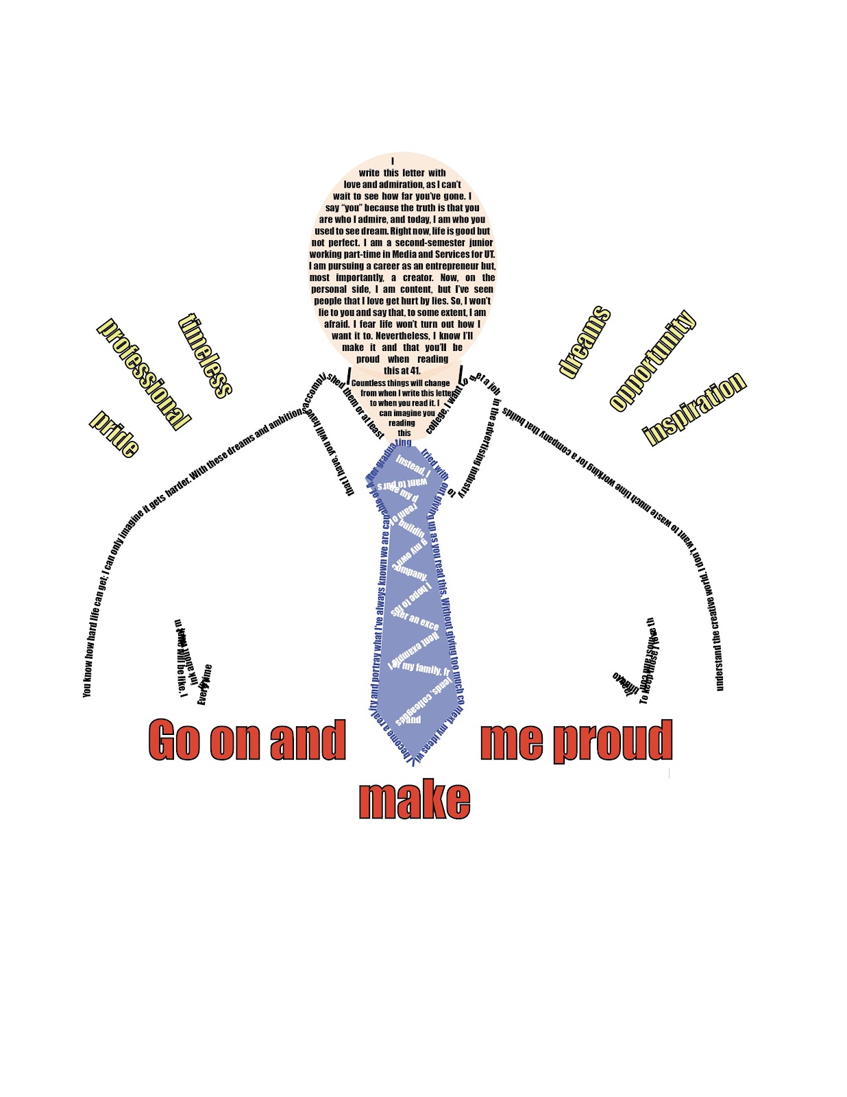
    The Calligramme project was definitely a great introduction to Adobe Illustrator. I had never used Adobe, but I had seen work others created with the application. I always found it intriguing that people created astonishing things using basic shapes or tools. Now that I finally have the opportunity to learn to use Adobe, I encountered my first project of many. It consisted of writing a letter to our future self 20 years from now. The words themselves reflected a timeless truth through a professional and elegant approach. Nevertheless, the second part of the project consisted of making a sketch that symbolized the letter. I drew a man in a shirt and tie. 
    It isn’t necessarily describing how I want to look in 20 years; instead, it's how I want to feel. The words in yellow above both shoulderspride, professionalism, timelessness, dreams, opportunities, and inspirationshowcase what I most want in this life. To be a good example towards others and myself. 
Moreover, as you can tell, the project took its final form when the sketch had to be created through text only. It was a long process, but I enjoyed every second of it. I learned to use the basic tools in Adobe Illustrator and expanded my creative knowledge. I look forward to the next project, as I'll continue to develop more skills and better understand the application. 


Letter:

Dear you,


I write this letter with love and admiration, as I can’t wait to see how far you’ve gone. I say “you” because the truth is that you are who I admire, and today, I am who you used to see dream. Right now, life is good but not perfect. I am a second-semester junior working part-time in Media and Services for UT. I am pursuing a career as an entrepreneur but, most importantly, a creator. Now, on the personal side, I am content, but I’ve seen people that I love get hurt by lies. So, I won’t lie to you and say that, to some extent, I am afraid. I fear life won’t turn out how I want it to. Nevertheless, I know I’ll make it and that you’ll be proud when reading this at 41. 

You know how hard life can get; I can only imagine it gets harder. With these dreams and ambitions that I have, you will have accomplished them or at least tried without giving up as you read this. Without giving too much context, my ideas will become a reality and portray what I’ve always known we are capable of. After graduating college, I want to get a job in the advertising industry to understand the creative world. I don’t want to waste much time working for a company that builds someone else's dream. Instead, I want to pursue my dream of building my own company. I hope to foster an excellent example for my family, friends, colleagues, and company members. To keep those I love the most and continue to meet great people. 

Every time I think about what my life will be like, I imagine a whole different person. Countless things will change from when I write this letter to when you read it. I can imagine you reading this while sitting beside your beautiful wife and children in the outdoor living room of your beautiful home. Through that hardworking ethic and all the skills that build our persona, dreaming big is merely the start. 

I know you’ll be professional and timeless when facing an opportunity. I’ve probably said this a lot, but through your pride, dreams will be accomplished, and your life will settle for the color blue— our favorite —reflected in the sky, promoting a state of inspiration, wisdom, and peace. 

Go on and make me proud. 


With love,

Your young self


Wednesday, January 24, 2024

Illustrator Tutorials


  1. I enjoyed this 10-minute tutorial as it perfectly introduced Adobe Illustrator. I found it helpful that the tutorial took the time to explain the workspace, pointing out each of the options to use and select before starting to create. It listed and explained the menu bar, toolbox, control panel, and others. The shape tools are something I believe will be easy, as you only click or drag to insert the shape. It showed how the anchors, paths, and handles can only be manipulated individually. I found it interesting that there are no limits to what you create in Illustrator. With all the basic options to shapeshift or fill with color, even a beginner can start to create simple designs.


  1. This second video explained the pen tool, startel tool, and curvature. The pen tool seems to be the most basic yet crucial function in Adobe Illustrator. It consists of choosing how many points the star has, and this was interesting because it showed a simple way of making a triangle. You can edit the triangle or shape any way you want with direct selection. Furthermore, the curvature part was confusing as I was unsure what the overlapping selection and shift M meant. It is definitely something I want to learn more about; likewise, the video ends by saying there is much more to Illustrator but that these basic tools will take you a long way.  


  1. For the last tutorial, I watched a more specific example of creating something. It showed the step-by-step instructions to create a vector peach using the essential tools. It started by describing how to sketch the peach before opening the illustrator. After you import your sketch, command plus shift plus p on the keyboard takes you to a template option for the layer. You start tracing the peach with the pen tool to create an outline. Adding color seems accessible as you create a new layer where you’ll select the parts of the peach that you want to color. I think I will struggle with remembering each tool and when to use it properly.

Final Portfolio

  ARTIST STATEMENT:  The final project for FMX 210 was designing our portfolio on Indesign. First, I sketched the portfolio layout to unders...